Half of Boston's Blocked-Bike-Lane Reports Come From Nine Corridors
- Jonathan Lansey
- August 19, 2026
- 8 mins
- Infrastructure
- bike infrastructure cities parking policy road safety
TL;DR
- Between July 4 and August 18, 2026, riders filed 959 reports of vehicles blocking Boston bike lanes through Loud Bicycle’s Bike Bureau; 955 snapped cleanly to a named street.
- Blocked lanes are not evenly spread. An optimization that hunts for short, high-density stretches finds 12 selections, each at most 800 meters long. After adjoining selections are merged, they form 9 geographic corridors covering 508 reports, or 53% of the total.
- Two clusters dominate: Kenmore Square (Brookline Ave, Comm Ave, and Boylston together—15.4% of all reports) and the Downtown / Chinatown spine along Cambridge, Tremont, and Kneeland Streets (13.8%, or 132 reports in one continuous run).
- The Longwood / Fenway medical corridor is the clear third at 9.5%; after that the tail drops off fast into single-digit shares scattered from Allston to Jamaica Plain.
- This is a prioritization map, not an engineering plan: it says where to look first, not where the project starts and ends.
- The finding lines up with a familiar pattern—paint-only bike lanes fail exactly where demand and conflict are highest—and with the case for physical protection over enforcement.
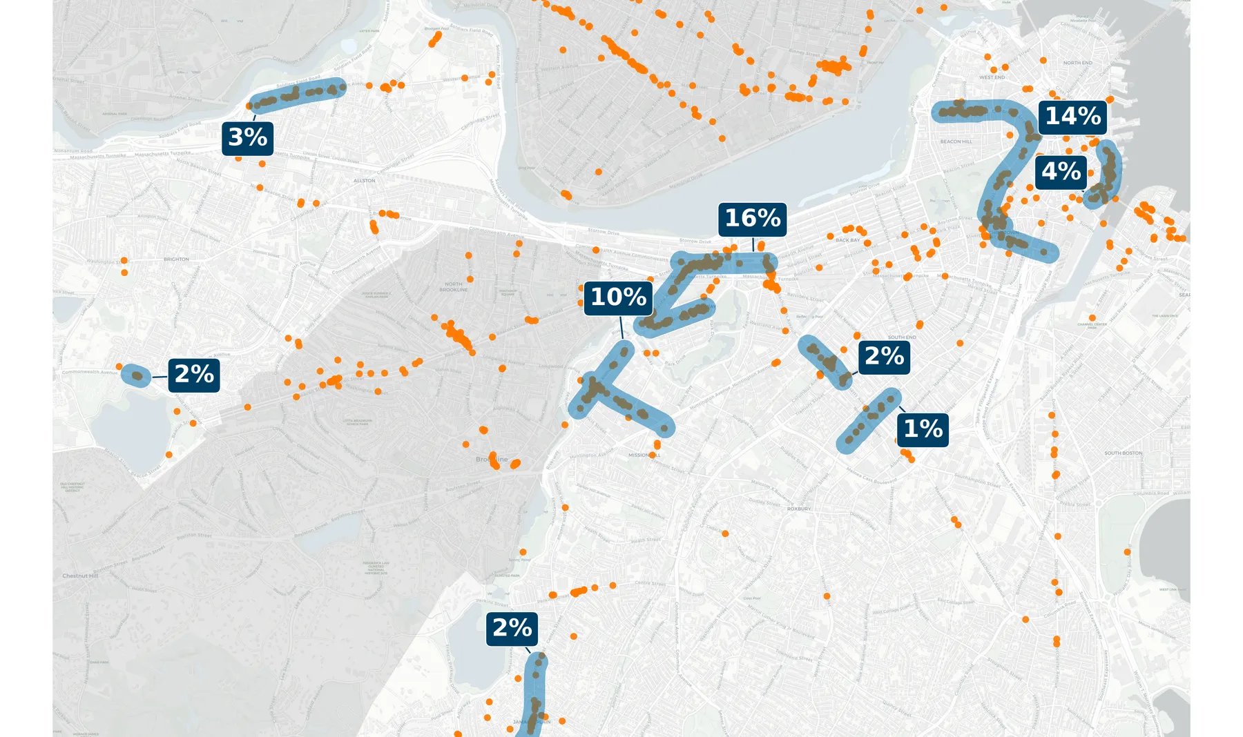
Each blue zone is a candidate protected-bike-lane corridor; labels are approximate whole-number callouts, with exact shares in the table below. Adjacent stretches are drawn as one corridor, giving nine labeled zones. Orange dots are individual reports. Non-Boston areas are shaded gray. Basemap © OpenStreetMap.
The reports aren’t random—so the fix doesn’t have to be either
When a car parks in a bike lane, the rider behind it makes a fast, unhappy choice: brake, or swerve into moving traffic. We’ve argued before that this is a safety failure, not an etiquette problem, and that the durable fix is physical protection rather than a police officer who arrives three and a half hours later.
But “build protected lanes everywhere” is not a plan a city can act on this budget cycle. The useful question is narrower: if Boston could harden only a few blocks first, which blocks would take the most danger off the map?
For most of the history of bike advocacy, that question was answered by anecdote—the corridor everyone complains about, the intersection a councilor bikes through. Crowdsourced reporting changes the input. When nearly a thousand geo-tagged, timestamped reports land in a shared, downloadable dataset over six weeks, the hotspots stop being a matter of opinion. You can compute them.
That’s what this piece does. The underlying numbers come straight from Bike Bureau’s public Boston data; the corridors below are the output of an optimization run over it, laid out here in plain English and geography.
What “nine corridors cover half the reports” actually means
The raw data is 959 dots on a map. Turning dots into corridors takes one modeling decision and one constraint.
The decision: a real protected-lane project is a continuous run along a single street, not a scattered cloud of points. So the analysis only considers contiguous, same-street paths—segments you could actually pour concrete along.
The constraint: no single stretch may exceed 800 meters (about half a mile). That cap matters. Without it, the “best” corridor would just be “all of Massachusetts Avenue,” which is true but useless for prioritization. Forcing each stretch to stay short means the model has to find genuinely dense clusters, not long streets that accumulate reports by sheer length.
From every report, the model builds the shortest same-street path that reaches its neighbors, generating 227 candidate stretches in all. Then it asks a precise question: what is the fewest stretches whose reports together cover at least half of the city’s total? This is a classic set-cover optimization, solved exactly with a mixed-integer solver (HiGHS)—not a greedy approximation. It returns both the answer and a proof that no smaller answer exists.
The optimization selects 12 short stretches. After adjoining selections are merged into the geographic corridors shown on the map, the result is stark:
Nine merged corridors contain 508 of 959 reports—53%.
At the constrained-stretch stage, twelve is provably the floor. The solver certifies that no 11 stretches can reach 50%—the best any eleven can do is 468 reports, or 48.8%. And among all twelve-stretch solutions, the selected placement captures the most reports, 508. The final count is nine only after adjoining selected stretches are combined for mapping and corridor-level planning; nine is not a separate minimum proven by the solver.
Half of every blocked-lane complaint in Boston over six weeks is concentrated into a set of corridors you could list on an index card.
Several selected stretches sit right next to each other—two arms of the same intersection, or two blocks of the same avenue split only because neither half fits under the 800-meter cap. Drawn on a map, they collapse into nine geographic corridors. The 800-meter cap applies to the 12 underlying optimization units, not necessarily to the merged corridors. The merged grouping is the one worth reasoning about, because a city plans by corridor, not by line segment.
The nine corridors, ranked
| # | Corridor | Streets in the cluster | Reports | Share* |
|---|---|---|---|---|
| 1 | Kenmore Square | Brookline Ave + Commonwealth Ave + Boylston St | 148 | 15.4% |
| 2 | Downtown / Chinatown | Cambridge, Tremont & Kneeland Sts | 132 | 13.8% |
| 3 | Longwood / Fenway | Brookline Ave + Longwood Ave | 91 | 9.5% |
| 4 | Waterfront | Atlantic Ave | 36 | 3.8% |
| 5 | Allston | Western Ave | 32 | 3.3% |
| 6 | Jamaica Plain | Centre St | 23 | 2.4% |
| 7 | South End | Massachusetts Ave | 19 | 2.0% |
| 8 | West Commonwealth Ave | Commonwealth Ave | 14 | 1.5% |
| 9 | South End | Washington St | 13 | 1.4% |
*Share of all 959 reports, rounded to one decimal place; independently rounded figures may not sum exactly to 53%. Corridors 1–3 are each built from two or three of the 12 underlying optimized stretches that fall within a block or two of one another.
A few things jump out of the table.
Two clusters carry the load. Kenmore Square and the Downtown / Chinatown spine together account for 29.2% of every blocked-lane report in the city. Kenmore is where Commonwealth Avenue, Boylston Street, and Brookline Avenue converge in a knot of bus stops, hotel drop-offs, and delivery traffic; the downtown route stitches through the loading-zone-heavy edge of the financial district and Chinatown in one continuous run of 132 reports. If Boston hardened only these two, it would touch nearly a third of the documented conflict.
Longwood / Fenway is the clear third front. The corridor around the hospital district—one arm on Brookline Avenue, one on Longwood Avenue—draws 91 reports (9.5%), where shift changes, patient drop-offs, and ambulances collide with a heavily-used bike route. Note that Brookline Avenue shows up in two different corridors here: its northern blocks belong to the Kenmore cluster, its southern blocks to Longwood. That’s not double-counting—they’re distinct hotspots that the map keeps separate.
The tail is long but shallow. After the top three, every remaining corridor sits in the single digits: the Atlantic Avenue waterfront (4%), Western Avenue in Allston (3%), Centre Street in Jamaica Plain (2%), two South End streets—Massachusetts Avenue and Washington Street—and an isolated stretch of Commonwealth Avenue out west. The spread reaches from the harbor to Brighton, confirming this isn’t only a downtown story—but the mass is unmistakably in the first three corridors.
What this map is, and what it isn’t
Two honest caveats sit underneath the numbers:
- The data is a sample of a behavior, not a census of the problem. Reports reflect where riders are and where they bother to report—so busy, bike-heavy corridors are over-represented relative to streets people avoid entirely. That’s arguably the right bias for prioritization (fix where people ride), but it’s a bias.
- Street snapping isn’t perfect. The analysis relies on OpenStreetMap names and a report-to-street matching step; it doesn’t claim either is error-free.
None of that undercuts the headline. Whether the true concentration is 53% or a few points either way, the shape is the same: a small number of corridors carry a large share of the danger. That is exactly the condition under which targeted protected infrastructure pays off fastest.
Why concentration is good news
A diffuse problem is demoralizing—if blocked lanes were spread evenly across every mile of Boston, no single project could move the needle. Concentration is the opposite. It means a modest, buildable program—nine merged corridors built from 12 sub-kilometer optimization units—could plausibly address half of the documented conflict. The same holds one city over: half of Cambridge’s blocked-lane reports fall inside twelve small curbs, one of them carrying a tenth of the city’s reports by itself.
It also reframes the enforcement debate. As we’ve written, citizen reporting is filling a gap that ticketing can’t, and cities like Boston have seen reports surge once the intake channel got fast enough. But every report is, ultimately, a data point begging for a design fix. This analysis closes that loop: it takes the raw evidence riders are generating and turns it into the one thing an advocate can hand a city engineer—here, first.
References
- Loud Bicycle. “Bike Bureau: Report Bike Lane Obstructions.”
- Loud Bicycle. “Bike Bureau: Download Data.”
- Loud Bicycle. “Bike Bureau Public Map.”
- OpenStreetMap contributors. OpenStreetMap. Basemap and street data.