The Fastest Way Around Boston: Bikes vs the T from Cleveland Circle
- Jonathan Lansey
- October 10, 2025
- 8 mins
- Safety
- bike infrastructure cities cycling transit
TL;DR;
- For most trips within Boston starting from Cleveland Circle, biking beats the T on door-to-door travel time, often by 5–15 minutes.
- The MBTA is fast in narrow corridors along rail and bus lines; outside those spines, waits and transfers dominate.
- Bikes are “always on”: no schedules, no transfer penalties, and almost no detours—your route can be close to a straight line.
- Travel-time (“isochrone”) maps make this visible: the T produces spiky branches; bikes produce almost a solid, expanding blob of reachable city.
- This isn’t an argument against transit—Boston needs it—but a reminder that safe cycling networks turn “nice to have” bikes into the fastest urban tool for many everyday trips.
In cities, speed isn’t how fast you go between stations. It’s how little time you spend waiting and detouring.
— A cyclist staring at a Green Line timetable
What “fast” really means in a city
Ask “What’s the fastest way to get around Boston?” and people immediately picture train speeds, top bus speeds, or how quick they can drive on Storrow (on the rare days it isn’t jammed). But those numbers miss almost everything that matters for real trips.
Door-to-door travel time is dominated by:
- How far you have to walk to the station or stop
- How long you wait for the next vehicle
- How many transfers you make
- How much you detour because the network doesn’t go where you want
- The time cost of parking, locking, and re-finding your vehicle
On a bike, most of that overhead shrinks dramatically. Typical urban cyclists ride at a comfortable speed that’s fast enough to cross a big chunk of Boston in 15–30 minutes, without ever consulting a timetable.
Transit can move a lot of people and can be very fast between stations, but those gains are diluted once you include walking, waiting, and transfers. That’s what I wanted to visualize.
The Cleveland Circle experiment
Boston has one of the better transit networks in the US, and Cleveland Circle is a good showcase. Within a short walk you get:
- Three Green Line branches (B, C, and D)
- Several bus routes
- Reasonable walking access to a dense residential area
If any place is going to show the T at its best, this is a fair test.
So I asked:
Starting from Cleveland Circle, how long does it take to get to everywhere else in Boston—by bike vs by the T?
From Google Maps to travel-time maps
To answer that, I used Google Maps to estimate travel times from Cleveland Circle to many points across Boston, for two modes:
- Bicycle
- Transit (the T + buses)
For each point, I recorded Google’s door-to-door estimate:
- Walking to the station/stop
- Waiting for vehicles
- Transfers
- Riding time
Then I turned those point estimates into continuous travel-time fields:
- Every location on the map gets a color corresponding to minutes from Cleveland Circle.
- I used Matlab to interpolate and render the time surfaces.
- For base maps and colors I leaned on Stamen Design and ColorBrewer, so the maps are readable and colorblind-friendly.
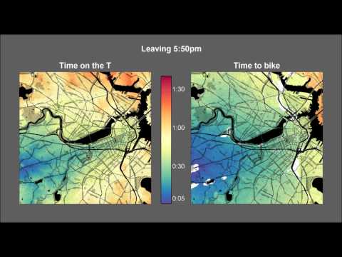
I also generated an animation so you can watch the reachable area expand over time, for bikes and for the T.
You can still:
- Explore the high-resolution biking map: http://bit.ly/biking_any_time
- Explore the high-resolution T map: http://bit.ly/T_Time_Boston
- Read about how the maps and video were made: jonathan.lansey.net/pastimes/mapping
What the maps show: spindly corridors vs solid coverage
Even a quick glance at the two maps side by side is enough to see the pattern.
The T map: fast, narrow corridors
On the T travel-time map, the fastest areas form thin tendrils extending along rail and major bus lines:
- Follow the D Line inbound and you see a narrow lobe of “fast” color pushing toward downtown.
- Similar lobes trace the B and C branches and a few higher-frequency bus routes.
But step off those spines and travel times inflate quickly:
- Moving between branches often requires slow crosstown links or a detour through downtown.
- Places that are geographically close can be network-far if transit doesn’t connect them cleanly.
If you animate the map, the T network flickers over time:
- Leave just in time to catch a train, and a destination might be in the “20 minute” band.
- Miss it by a couple of minutes, and the same destination suddenly jumps to “30+ minutes.”
Your experience is shaped by schedules and transfers as much as by raw train speed.
The bike map: a steady, expanding blob
On the bicycle travel-time map, Cleveland Circle sits at the center of a smoothly expanding blob:
- In ~10 minutes you cover much of Brighton and Allston.
- In ~20 minutes you’re touching Brookline, Fenway/Kenmore, Longwood, and parts of Cambridge.
- In ~30 minutes you’ve reached large parts of Somerville, downtown, and Jamaica Plain.
There are some distortions:
- The Charles River pushes things out a bit.
- Major highways and awkward crossings matter.
- Hills nudge the blob slightly.
But the overall shape remains round and continuous, not spiky. And unlike transit, the bike map doesn’t flicker—if you leave now or in ten minutes, the times barely change. There’s no schedule to miss.
Why bikes often win on door-to-door time
For a lot of trips under about 5–6 miles, the maps match something Boston cyclists already know from experience.
-
No waiting
Bikes are “always on.” You don’t wait 10 minutes for a bike to show up; you unlock it and go. For short trips, that alone can be a bigger time savings than any speed advantage of a train between stops.
-
Direct routes
Transit forces you into the shape of the network:
- Go inbound, then outbound on another branch
- Or take a meandering crosstown bus
On a bike you can often go door to door in a nearly straight line, limited mainly by one-way streets and rivers.
-
Minimal access and egress time
Every transit ride includes two walks: home → stop and stop → destination. Even 7–10 minutes on each side is a huge chunk of a 20–30 minute trip.
With a bike, your “stop” is your front door, and you usually can lock up very close to where you’re going.
-
Predictability
The T is vulnerable to slow zones, delays, bunching and crowding. A bike’s variability comes mostly from traffic lights and how hard you pedal, which is a lot easier to predict day to day.
Put all that together and you get a simple rule of thumb:
For many intra-Boston trips of a few miles, a bike is the quickest tool you can grab, even in a city with pretty good transit.
Bikes and the T are complements, not enemies
This isn’t an argument to replace trains with bikes. The T does something bikes can’t: move thousands of people per hour along a single corridor without gridlocking the city.
Instead, the maps suggest a better framing:
- Transit provides high-capacity spines into and through the city.
- Bikes fill in the gaps—short, cross-town, and off-corridor trips where transit is structurally clumsy.
The fastest version of Boston is:
- Trains and buses doing longer and trunk trips, especially in and out of the core.
- Bikes and walking dominating short and medium trips inside that core.
- Infrastructure that makes switching between modes effortless (safe bike parking at stations, good crossings, low-stress local streets).
What this means for street design
If bikes are already competitive with the T for many trips starting from a strong transit hub like Cleveland Circle, a few policy implications follow.
-
Short trips are low-hanging fruit
A huge share of urban car trips are short. A connected, low-stress cycling network could move a large fraction of those trips to bikes, which:
- Frees road space
- Reduces emissions
- And, as the maps show, often reduces travel time for the person making the trip
-
Measure accessibility, not just speed
It’s easy to obsess over vehicle speeds—raising or lowering limits, tuning signal timings. But what people actually care about is how much of their life is spent getting from A to B.
Travel-time maps give a better metric: how much city you can reach in 15, 30, or 45 minutes. Bikes massively expand that reachable area in the 15–30 minute band.
-
Networks matter more than one-off projects
A single nice bike lane is like a single T branch with no connections. These maps underline that connectivity is everything.
- A patchwork of disconnected bike lanes won’t produce a solid “fast blob.”
- A coherent grid of safe routes will.
Wrapping up
So, what’s the fastest way to get around Boston?
- If you’re traveling from one Green Line node to another along the same branch at just the right time, the T is fantastic.
- But for a huge number of everyday trips inside the city, especially starting from places like Cleveland Circle, a bicycle quietly wins the speed contest—no timetable required.
The travel-time maps just put color on something many riders already feel in their legs: in a city like Boston, once you have a reasonably safe route, the bike turns out to be the real express service.