Twelve Loading Zones Could Cover Half of Cambridge's Blocked-Bike-Lane Reports
- Jonathan Lansey
- August 19, 2026
- 9 mins
- Infrastructure
- bike infrastructure cities parking policy road safety
TL;DR
- Between July 4 and August 18, 2026, riders filed 355 reports of vehicles blocking Cambridge bike lanes through Loud Bicycle’s Bike Bureau.
- An exact optimization finds 12 locations, each a 200-meter-wide circle, that together cover 181 reports (51%).
- A single circle in East Cambridge near Kendall Square holds 38 reports—10.7% of the entire dataset on its own.
- Protected lanes are still the real fix—the reports trace continuous lines down Mass Ave and across Kendall, the kind of corridors that want a barrier for their whole length. But Cambridge is already rolling out loading zones as a curb measure, and this is a map of where each new one would do the most good.
- Crowdsourced reports let the location decisions be aimed by evidence.
- The same pattern shows up one city over: half of Boston’s blocked-lane reports come from nine corridors.
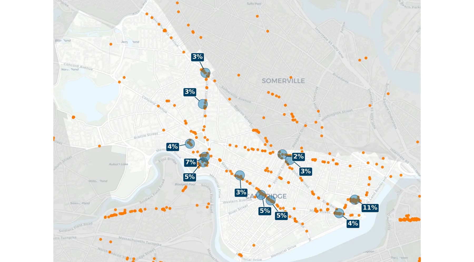
Each blue circle is a recommended loading-zone location, 200 meters across; the label off to its side is that circle’s share of all reports. Orange dots are individual reports across the whole frame; non-Cambridge areas are shaded gray. Circles are drawn at true geographic scale. Map data © OpenStreetMap contributors © CARTO.
The city is adding loading zones, this maps where they’d help most
Let’s be clear about the real fix first. Protected bike lanes are the durable answer, and this map argues for them as loudly as the Boston corridor map does: the reports don’t just speckle a few isolated curbs, they trace continuous lines down Massachusetts Avenue and across the Kendall Square grid. Those are corridors that want a physical barrier along their whole length—a mile of protection, not a spot treatment.
One of the levers it’s already pulling is the loading zone: a short, legal stretch of curb where a delivery van, a contractor, or a rideshare can pull over for a few minutes instead of stopping in the bike lane to do it. That program is underway regardless. The open question is where each new zone does the most good—and that’s a question the reports can answer.
Every Bike Bureau report is a person flagging a specific blocked bike lane. Pool 355 of them and the loading-zone rollout stops being about which block complained loudest; it becomes a matter of evidence—put the next zone where the reports actually pile up. The analysis below is that targeting layer. And because a loading zone is a point on a curb rather than a route, the right unit here is a small circle—a short walkable catchment around a candidate site—rather than Boston’s street-length corridors.
The optimization: the smallest set of circles that covers half the reports
The object. Fix a diameter of 200 meters—about a two-and-a-half-minute walk end to end, a realistic catchment for a single loading facility and its immediate approaches. Every candidate “zone” is a circle of that size. A report is covered if it falls inside the circle.
The question. What is the fewest circles whose reports together cover at least half of the 355 reports (the target is 178)? This is a partial set cover—partial because we don’t need to catch every report, just the majority, and cover because each circle “covers” the reports inside it.
Generating candidates. A circle could sit anywhere, so in principle there are infinitely many. Geometry rescues us: any circle of fixed radius can be slid until its boundary touches one or two reports without losing any of the reports it already held. So the complete candidate family is just (a) one circle centered on each report, plus (b) the two circles of the given radius that pass through each pair of reports less than 200 meters apart. Deduplicate identical coverage sets, drop any circle whose catch is a strict subset of another’s, and Cambridge’s 355 reports reduce to 164 distinct candidate circles. That finite set provably contains an optimal solution.
Solving it exactly. The reports are first projected onto a Cambridge-centered azimuthal-equidistant plane so that “200 meters” means the same thing everywhere on the map. Then a binary mixed-integer program runs in two stages: first minimize the number of circles needed to reach the 50% target, then—holding that minimum count fixed—maximize how many reports the chosen circles actually cover. The HiGHS solver returns a zero optimality gap on both stages, so these aren’t good guesses; they’re proven optima.
The result:
12 circles cover 181 of 355 reports—51%. No 11 circles can cover more than 174 (49%).
It isn’t merely that twelve zones happen to work; it’s that eleven provably cannot clear half the city. Twelve is the exact price of covering a Cambridge majority, and the placement below is the one that, at twelve, catches the most reports possible.
The twelve locations
| Zone | Neighborhood (nearest square) | Reports | New coverage* |
|---|---|---|---|
| 1 | East Cambridge — Kendall / Main St | 38 | 38 |
| 2 | Harvard Square (Mass Ave) | 23 | 23 |
| 3 | Central Square (Mass Ave, west) | 18 | 18 |
| 4 | Central Square (Mass Ave, east) | 17 | 17 |
| 5 | West Cambridge (Concord Ave) | 13 | 13 |
| 6 | Kendall Square / MIT | 13 | 13 |
| 7 | Porter Square (Mass Ave) | 12 | 12 |
| 8 | Mid-Cambridge (Mass Ave) | 11 | 11 |
| 9 | Mass Ave (Harvard–Porter) | 10 | 10 |
| 10 | Inman Square / Hampshire St | 10 | 10 |
| 11 | Harvard Square (Mass Ave, north) | 16 | 8 |
| 12 | Inman Square (Hampshire St) | 8 | 8 |
*“New coverage” is reports this zone adds beyond the higher-ranked zones. Zone 11 sits partly inside Zone 2’s catchment, so it holds 16 reports but adds only 8 not already covered—which is exactly why the optimizer still selects it over a fuller-but-redundant circle elsewhere.
A few things the table makes plain:
Kendall is the epicenter, and it isn’t close. Zone 1—along Main Street in the East Cambridge biotech district—holds 38 reports, 10.7% of the whole dataset, and with the nearby Kendall/MIT circle (Zone 6) the Kendall cluster alone accounts for 51 reports. This is the signature of a specific land use: lab buildings, life-science tenants, and constant commercial deliveries meeting a heavily-ridden bike network. It should be read as concentrated, recurring loading demand—not as one of twelve interchangeable dots. This outlier may also reflect a more dedicated userbase in this area.
The squares along Mass Ave carry most of the rest. Central Square (Zones 3 + 4, 35 reports), Harvard Square (Zones 2 + 11), Porter (Zone 7), and the Mass Ave blocks between them light up in sequence. These are exactly the places with the most storefronts, the most curbside churn, and the least spare room—the textbook case for formal loading zones over ad-hoc double-parking.
Overlap is a feature, not a bug. Zone 11 overlaps Zone 2 and still gets picked. That tells you Harvard Square’s demand is too large and too spread to sit inside one 200-meter circle: it needs two. The optimizer surfacing that is more useful than a tidier map would be.
A targeting layer, not a substitute for protection
Two ways to misread this map are worth heading off. The first is to treat the twelve circles as enforcement targets—send a meter maid, write more tickets. The second is to treat a loading zone as a replacement for a protected lane. Neither is right.
A driver double-parks in a bike lane because it’s the only stop available in the ten seconds they have; a nearby legal loading zone changes that choice without a citation. But a loading zone doesn’t separate bikes from traffic the way a barrier does—it just removes one recurring reason the lane gets blocked. The endgame is still continuous protection along these corridors. What the reports buy Cambridge in the meantime is aim: a way to place a curb program it’s already running where the evidence is densest, and, in the same breath, to document exactly which corridors have earned a barrier.
And the evidence is unusually actionable here because it’s concentrated. If Cambridge’s 355 reports were scattered uniformly, no dozen curbs could touch half of them. Instead, twelve short stretches of curb—one of them doing over a tenth of the work by itself—could. That is a program a city can actually budget and build, and a case for protection it can’t easily wave away.
What the map is—and isn’t
The circles are priorities for curb review, not stamped designs. The model knows where reports cluster; it does not know where a bus stop, a hydrant, a driveway, an accessible parking space, or a travel-lane transition already claims the curb. Zone 1’s 38 reports say “solve loading here”; they do not say which side of Main Street, how long the zone should be, or how it interacts with the protected lane already in place.
Two honest caveats sit under the numbers:
- Reports track behavior, not the full problem. They reflect where riders are and bother to report, so busy, bike-heavy squares are over-represented relative to streets people already avoid. For prioritization—fix where people ride—that bias mostly points the right way, but it is a bias.
- 51% is exact within its inputs, not beyond them. The 12-zone minimum and the 11-zone impossibility are proven for this snapshot of reports and this 200-meter diameter. Change the window, the diameter, or the snapshot and the specific circles shift; the shape—a few curbs dominating—is the robust finding.
The headline survives all of it: in Cambridge, half of the documented bike-lane conflict lives at twelve areas and fixing them could make a big impact.
References
- Loud Bicycle. “Bike Bureau: Report Bike Lane Obstructions.”
- Loud Bicycle. “Bike Bureau: Download Data.”
- HiGHS. “High-performance software for linear optimization.”
- OpenStreetMap contributors; CARTO. OpenStreetMap. Basemap and street data.